The sidebar in your component library now shows all the groups, blocks, and components in your library, with new default collapsed view. You can now easily see and navigate your complete component library, no matter how big it gets, from one browsable sidebar.
We’ve improved your search abilities across Ditto — now from one simple keyboard command!
Type ⌘ + K (or Ctrl + K on Windows) from anywhere in Ditto, and a universal search bar will pop up. From here, you can search:
Try it out, or read more in our help guides!
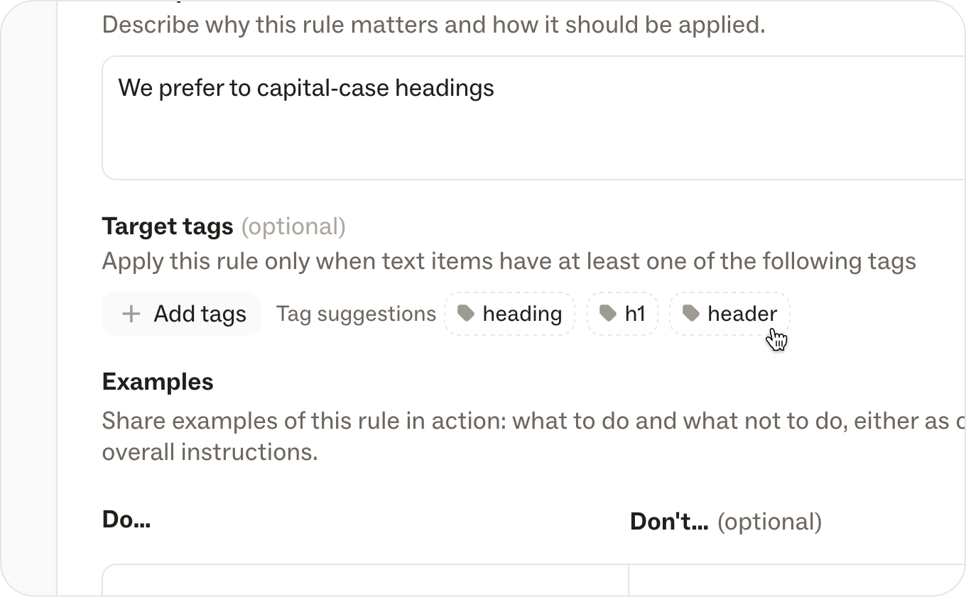
We’ve given you more control over how you import new components! Now, when you import files with one or more existing strings, you’re now presented with three options:
Our team has been hard at work (for months!) to diagnose and improve the speed and load times of the Ditto plug-in. You should see huge speed-ups in the following areas:
Bug fixes:
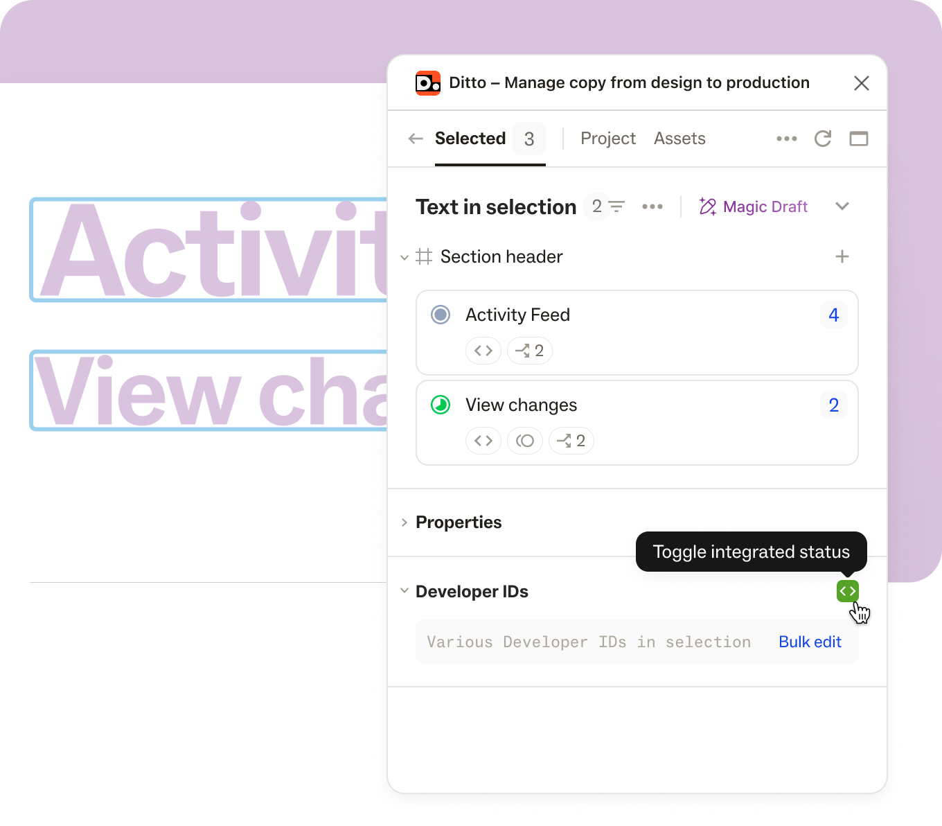
Now you have the option to automatically attach any text to a component if that text is a 100% match. To turn this on for your project, open the “Sync Settings and Automation” and select automatically attach exact component matches. Once you check the box, Ditto will automatically attach any components to existing text, or any time you edit text to match a component.
If you want to make sure you don’t miss a frame while a designer is iterating, you can automatically sync any new Figma frame into Ditto.
To turn on this functionality, open “Sync Settings and Automation” in your project, and select automatically sync new frames. This will automatically sync any new frames detected in the linked Figma file, so you can keep pace with your designer’s iterations.
Is your team using variants to work through translations, personalized touch points, or A/B tests? Track progress on your variant text with new variant statuses!
Now you can mark a variant’s text as In Progress, Ready for Review, or Final, and Ditto will color-code the base block with each variant’s unique status.
We’ve improved the navigation and discoverability of some key elements, to make it easier for teams to get started, and get going, in Ditto.
Here’s what has changed:
See who is assigned on a card, at a glance: New assignee bubbles are now displayed on projects, components, and search pages!
A long-requested quality of life update! Easy click-and-drag resizing is now available for lefthand columns in the Ditto web app.
We now automatically detect if an unlinked frame already matches an existing draft group — and automatically match up all of the corresponding text items for you. All you have to do is review and accept. 🤩
On the project card, you'll now be able to see an overview of core stats:
You'll also be able to see this broken down in each project's project details.
You can now see the avatars of anyone else working from the same project! These teammates will display in the project toolbar, whether they're working from the web-app or the Figma plugin.
Cmd/Ctrl + K
will now collapse and expand all groups and blocks in the side nav.nested
format, add an explicit --sample-data
flag, and patch dependencies with outstanding vulnerabilities. (v4.4.0)How are other teams managing product text? What have they learned, and what are still their biggest bottlenecks? How are content and design orgs evolving? 🤔 💭
We want to get into the nitty-gritty of how teams are managing product text — in all of its forms — and we want to hear from you. Take this survey (and share it with a friend!). We’ll share the results in the coming weeks.
We're so excited to announce that Ditto is an official sponsor of Config this year! ✍️ 🎨
From speaking at Config to meeting so many Ditto users in person, we’re honored to represent content and support an event at this scale for the first time. For those attending this June 26-27, we can’t wait to see you there at our booth and lightning talk! 🤗